The most pleasing "look", to me, is the XM1. I'm reasonably sure that it's not down to one individual camera. My sample includes footage from three different examples, and they are much more like each other than they are like the other models in my sample. Nor is it down to post-processing. My friends and I aren't really into that, except where really difficult lighting conditions have made it necessary. Even then, we just tend to increase the contrast a little. I know that the XM1 is not neutral, having a slightly warm (orange?) cast, but that's part of its charm, especially on a cold or grey day. I suppose it's like preferring Kodachrome 64 to Ektachrome or Fuji (which I do).
I used an XM1 from 2000 to 2006, and loved it. However, when it's tape drive became unreliable, I replaced it with an XH-A1. The newer, HDV camera is much better in many ways, but I do wish I could make it look more like the XM1. So, I have started doing some experiments, to see if I can come up with a preset for the XH-A1 that gives the feel of the XM1. I'm a novice at this sort of thing, and I don't have professional test cards, lights, monitors, scopes, etc. I do have an NLE (Avid Liquid) with colour scopes built in, but I can see that it could be a rather long-winded processes, so all advice is very welcome, especially if it cuts down the time required.
Has anybody done something similar already with the XM1/GL1? I've searched the DVinfo.net "XH Custom Presets Download Library" thread for "XM1" and "GL1" but found nothing. It would be great to have another reference-point. Has anybody written anything that describes how to adjust the colour-gain and colour-matrix parameters to make a particular effect? In particular, how do the matrix parameters work? I would like to read a bit more theory (so long as it's fairly practical!) before doing the experiments!
My plan of campaign goes something like this:
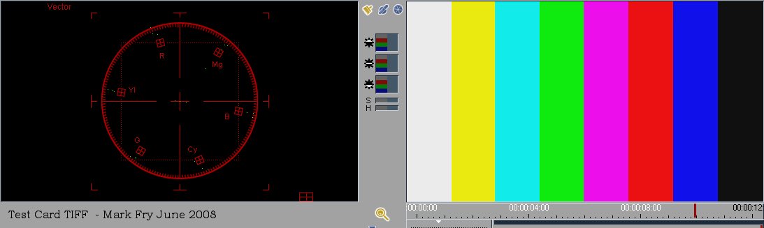
To start with, this is what happens when the test-card TIFF file is imported directly into the timeline. The vectorscope just shows a few tiny points near to, but just outside, the "ideal" colour targets, showing how "pure" the colours in this image are.
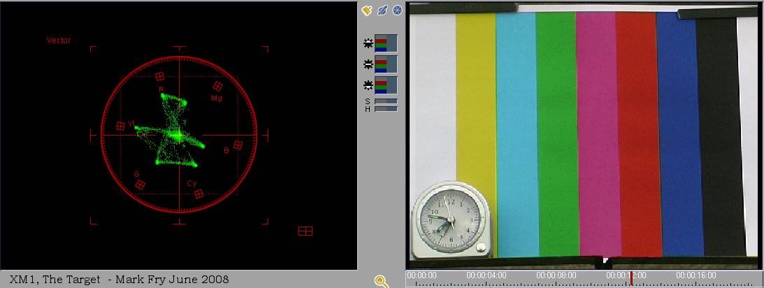
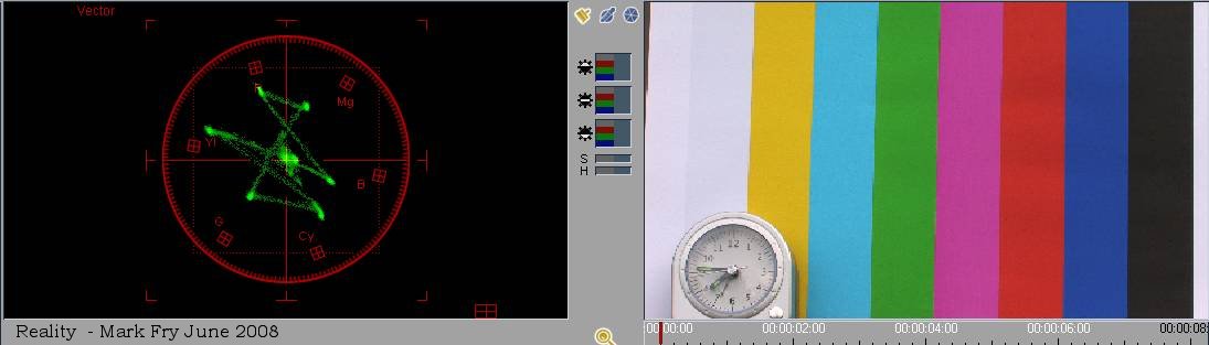
This is what we are aiming at. In the less-than-ideal conditions of my tests (uncontrolled outside lighting, test card printed on non-flat paper by an uncalibrated printer, bad framing, etc.), the important thing is to what extent I can make the plot from the XH-A1 look like this (in the same conditions). The red (R), yellow (Yl) and green (G) points are pretty well on-axis (by which I mean imaginary lines from the centre to the "pure" colour markers), but the cyan (Cy), blue (B) and particularly magenta (Mg) points are noticeably deflected from their ideals. Also, the red and yellow points are closer to the ideal markers than the others. The XM1 has a reputation for giving warm images (compared to, say, the Sony VX2100's cool neutral/blue look). Looking at this plot, perhaps that's due the relative strength and fidelity of its response to red and yellow, compared with the other colours? Also notice the flat bottom line from green to cyan. Perhaps surprisingly, the yellow bar looks rather green-ish in the image.

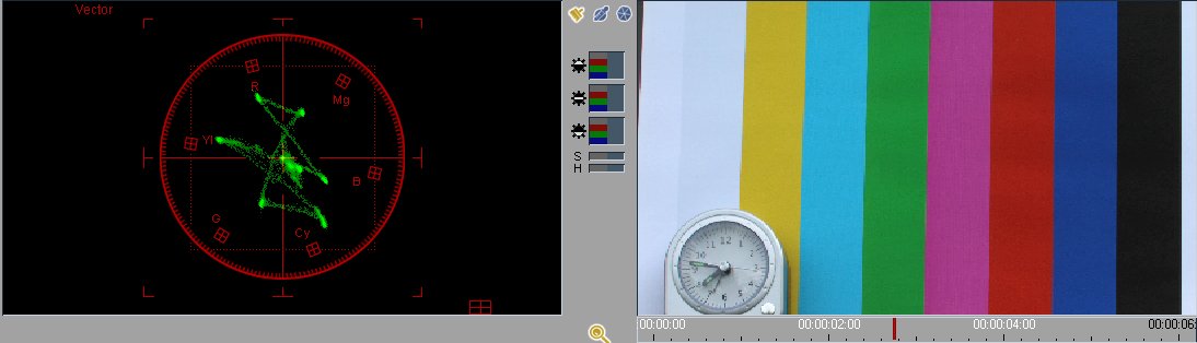
This is the XH-A1 factory default. A couple of things strike me: 1) The plot is less noisy, with narrower lines between the points and fewer dots away from the lines. To some extent, this is because the test card is better framed, but also because the HDV image and the bigger, better HD lens gives better resolution and less overlap between adjacent bars. 2) the points are nearer the centre so less intense/bright, especially the green. The whole plot is twisted slightly clockwise, most noticeably the yellow and magenta.
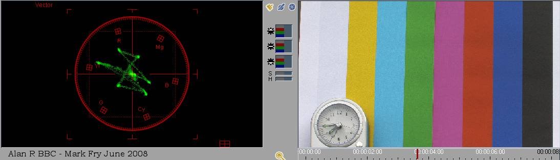
In his assessment of the XH-G1 (same as an XH-A1 but with added HD-SDI connections) for the BBC, Alan Roberts provides a suggested preset and says "efforts were directed at getting a decent colorimetric performance from the camera. Assuming that a grading operation will be used in postproduction, the settings attempt to give the colourist a reasonable exposure range, but this is inevitably well short of what a film stock could be expected to deliver." I used this preset quite a lot for a few months, and the results are bright and vivid with especially strong yellows. Guess what? The plot reflects this, with the yellow point well towards the circumference, and the reds and greens shifted towards yellow.
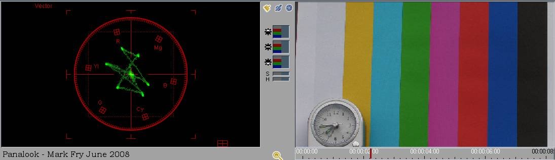
This preset is intended by its author, Stephen Dempsey of Pinelake Films, to mimic the look of the Panasonic DVX100A miniDV camera, much beloved by indie film makers. This version is adapted from the original one developed for the XH-A1's big brother, the XL-H1, which has the same parameters as the XH-A1 but different scales for some of them (-9 -> +9 rather than -50 -> +50, IIRC). It has been further refined more recently...

This, I think, is Stephen Dempsey's second attempt to mimic the Panasonic DVX100A. The pattern of the plot is very similar to PanaLook, but the points are closer to the centre and the picture reflects this, having slightly less intense colours.
This is a bright, colourful preset but I've not used it for real yet. During my very brief tests it felt a little artificial (despite its name!)
"TrueColor", created by Paolo Cicone, was created scientifically using a professional test card, lit by 3200K lights in a studio, and a program called DVrack which provides a full set of scopes and monitors in software, which allowed him to make adjustments and see the results instantly. Paulo's aim was to get the points of the vectorscope plots onto the "ideal" markers. Some people have commented that this preset feels rather "blue", and looking at the blue, white and especially the cyan bars in the image, you can perhaps see why. Looking at the plot, the cyan and blue points are stronger than other presets. One thing I find a little surprising is how long (bright) the lines are. I have used this preset a few times recently, and when viewed on my HDTV, and particularly through the viewfinder, this preset seems quite dark to me. Maybe this is a result of the low set-up and pedestal levels, and the low ("crushed") black setting? I need to read-up about such things a little more. Paolo is a fan of "film look", so that may have something to do with his choices?

Another of Stephen Dempsey's presets, this one is intended to add the "pop" that the rather bland default setting lacks. I haven't used this one in anger yet, but during my tests it did look very bright and intense, perhaps too much so? On the other hand, it is one of the most-used (or at least, most often mentioned) of the presets posted on DVinfo.net.
 Test
Card
Test
CardSteam Age home page
Steam Age Pictures - steam railway videos
this page updated 10/01/2010